NASA Artemis Branding
I was proud to serve as a member of the Artemis brand tiger team, tasked with overhauling the brand in 2020. We worked with Superunion to develop a visual identity and tone of voice to represent the next era of human exploration. We created brand resources and rolled out the updated look and feel to teams across NASA for use. I designed the core PowerPoint templates and continue to support brand compliance and lead periodic brand workshops.
With the recent successful completion of Artemis I, NASA moved one step closer to putting the first woman on the Moon. This mission was the largest usage of the updated brand yet and we have received excellent feedback on the bold new look and feel, which is unlike anything NASA has done before.
Highlighted skills: brand strategy; type design; color theory; logo design; audience research
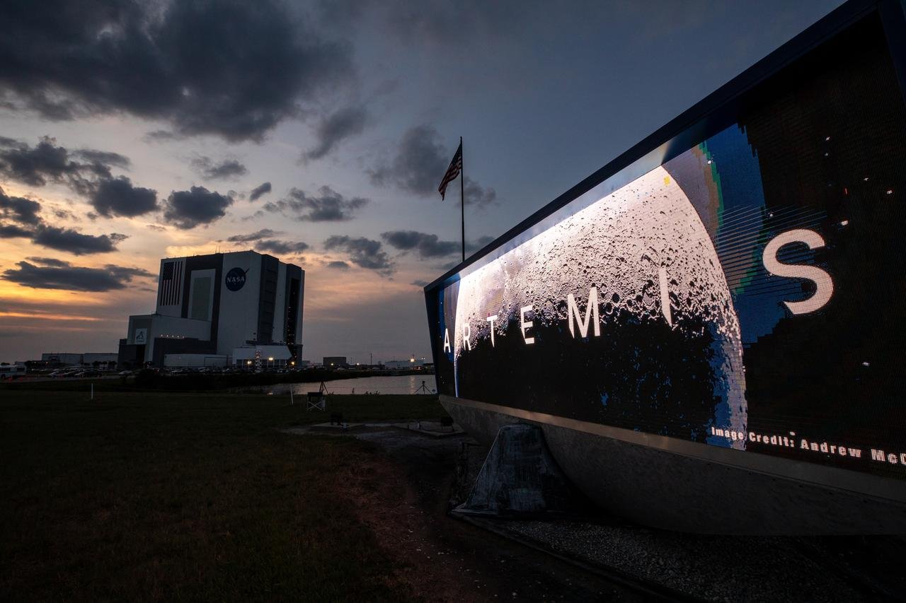
Artemis branding application example: Artemis Inter font is displayed with the iconic Vehicle Assembly Building in the background
Artemis branding application example: broadcast graphics package used for all Artemis I mission coverage
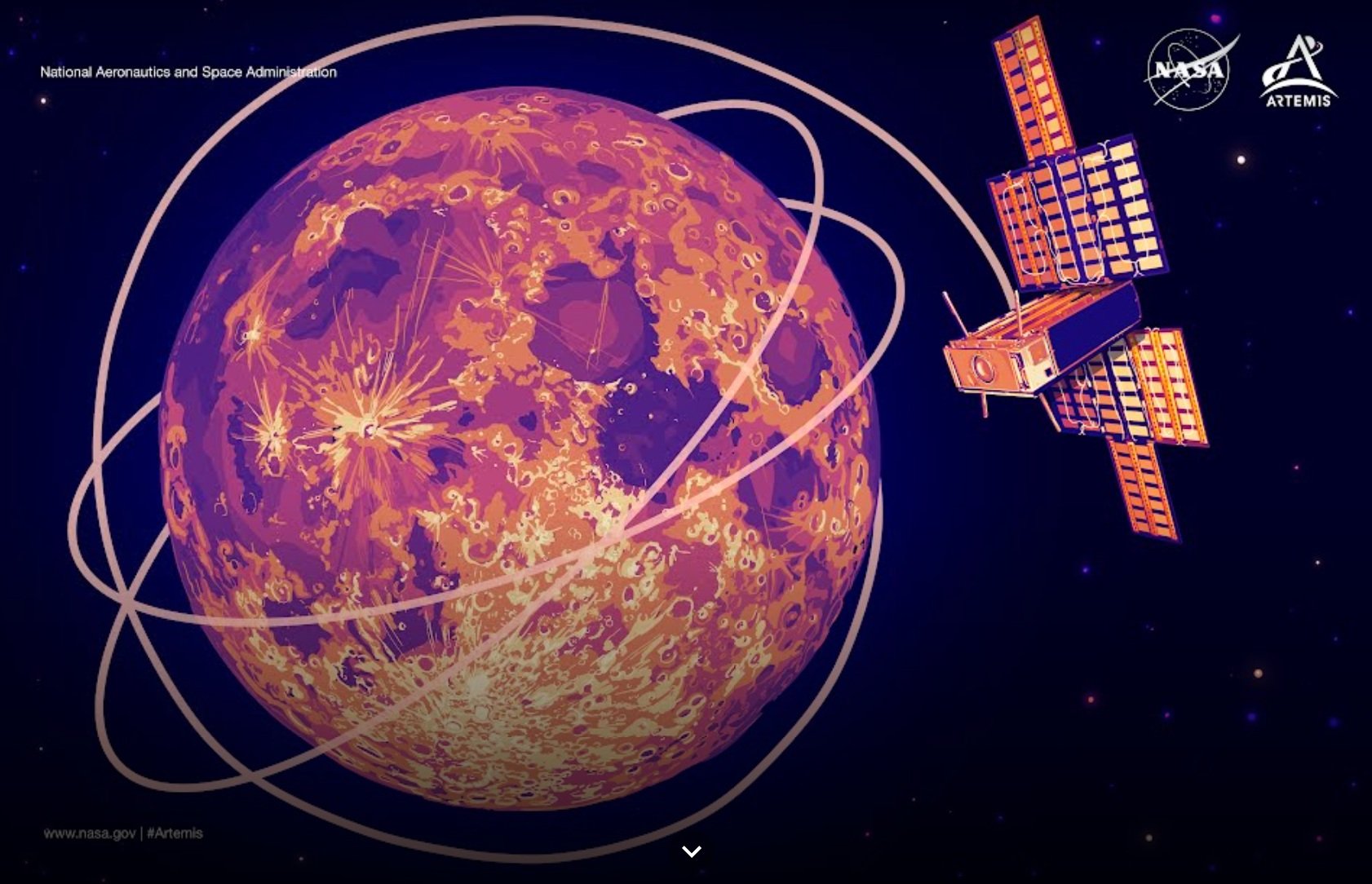
Artemis branding application example: illustrations for Google Arts & Culture story featuring Artemis I payloads - I provided the text and creative direction for this product which you can view here
Artemis branding application example: Artemis I mobile launcher banner (bottom left of platform below rocket)
All images from NASA public assets and pages - see nasa.gov for more about NASA’s exploration plans
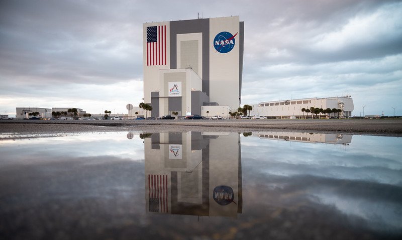
Artemis branding application example: Vehicle Assembly Building banner showcasing the upgraded logo
Artemis branding application example: Vehicle Assembly Building banner showcasing the upgraded logo
Please note: Artemis brand resources are not currently available to the public. These samples are shown to illustrate implementation of the brand and do not represent products I personally designed or created. As with all NASA products, all work is collaborative and credit belongs to the excellent communications teams across the agency.


